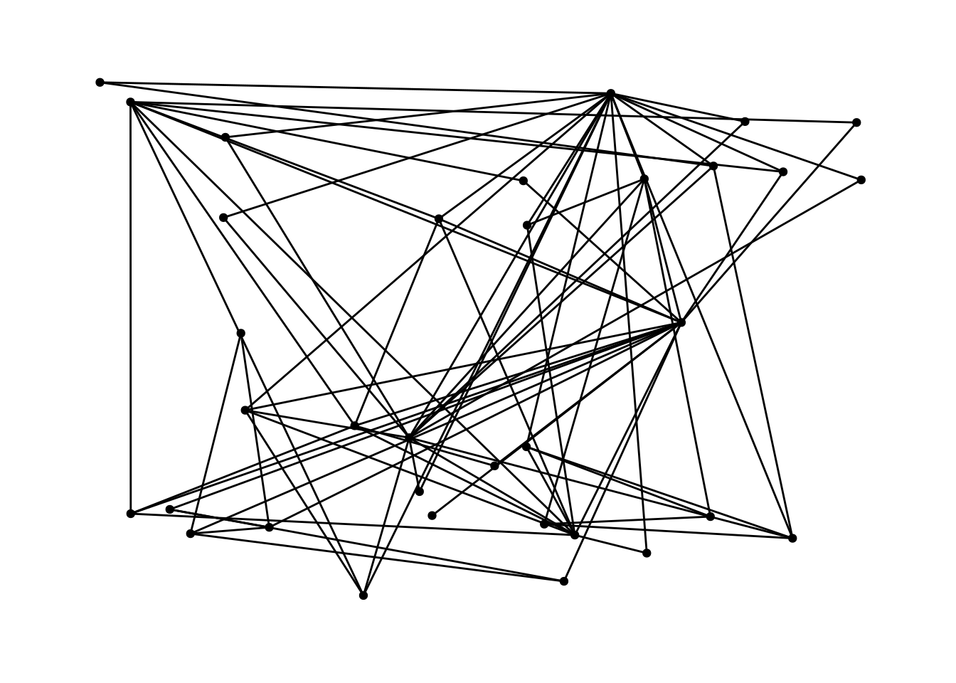
G <- create_notable('zachary')

G |>
  ggraph() +
  geom_edge_fan()
Using "stress" as default layout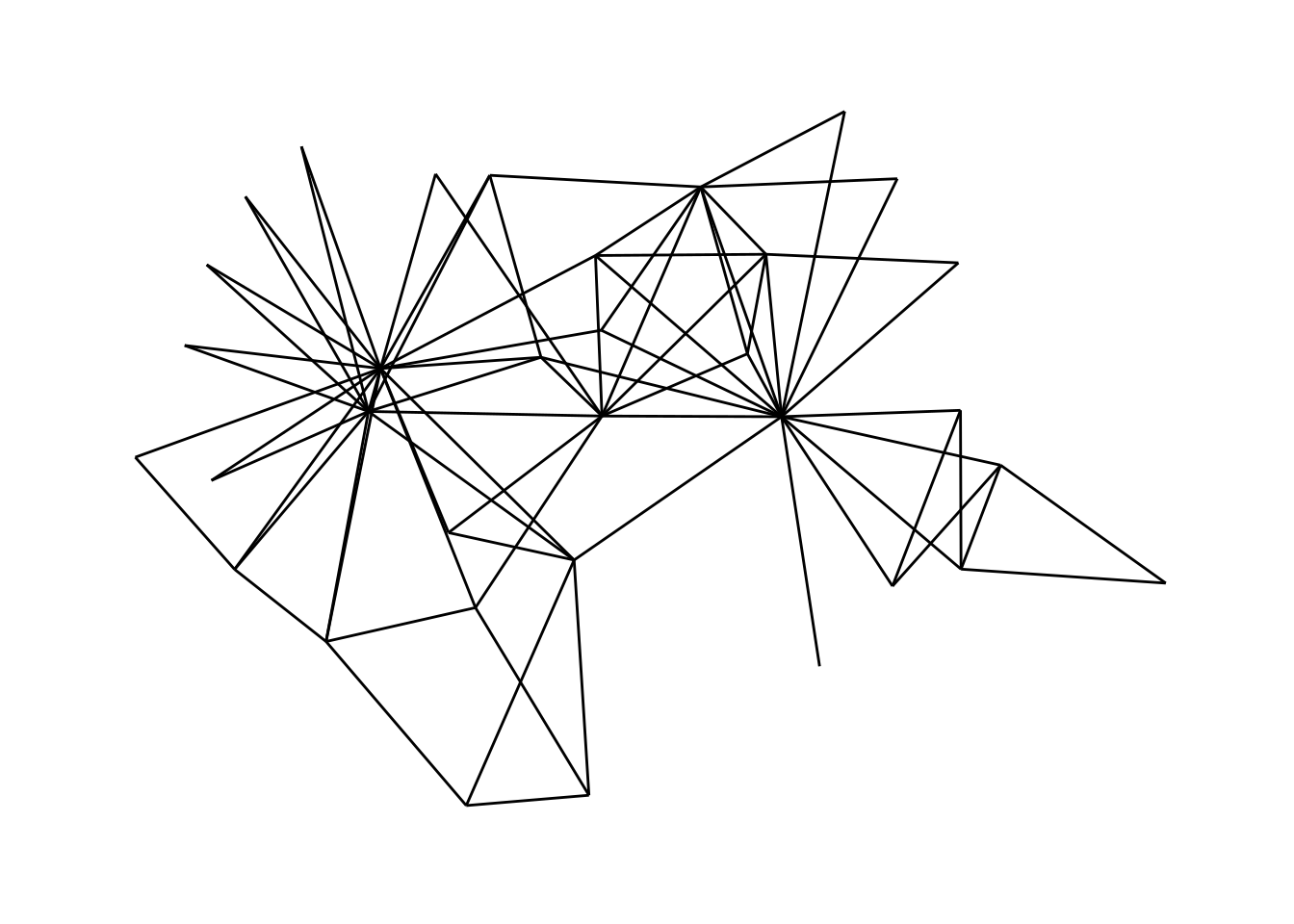
tidygraph is the package we’ve been using to manipulate network objects—doing filtering, mutating, etc. The companion package to tidygraph is ggraph, which is designed to let you visualize networks. ggraph is a set of tools based on ggplot2. The key idea behind both ggraph and ggplot2 is that you can build a plot by adding layers according to a “grammar of graphics”. Each layer lets you add to and change things about the plot.
ggraph includes tons of really cool types of plots but for this tutorial I am going to focus on standard plots that show nodes as circles and edges as lines. There are three key components that should be part of any of these plots:
By this point, you should know what edges are. ggraph has a number of different options for how to draw edges. Let’s start with the simplest possible network visualization. This shows the Zachary karate network with straight line edges.
The ggraph() command tells R to make a ggraph visualization from a network.
geom_edge_fan() draws the edges.
G <- create_notable('zachary')
G |>
ggraph() +
geom_edge_fan()Using "stress" as default layout
Note that there aren’t any nodes in this picture—it’s just the edges.
All of the different edge options start with geom_edge_, so if you start typing that then R’s autocomplete will show you the options, and you can play around by changing them around.
Next, we’ll add the nodes. This is where ggraph gets really cool. We treat the nodes like just another layer of the plot. We use the plus symbol (+) at the end of each line to tell R that we want to add another layer.
G |>
  ggraph() +
  geom_edge_fan() +
  geom_node_point()
Using "stress" as default layout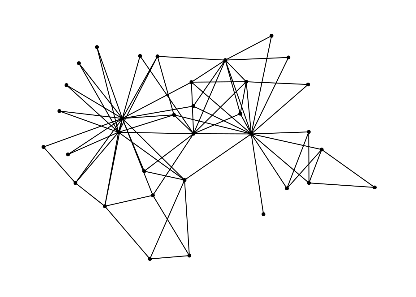
While there are quite a few different options for nodes (start typing geom_node_ to see them all), most of them are designed for different types of plots. We will typically just use geom_node_point.
Both geom_edge_ and geom_node_ functions take parameters. Parameters are input that a function takes in that changes what it outputs. In this case, the parameters for the nodes and edges adjust how the visualization looks.
For example, maybe we think that the edges are too thick, and that they should be Boilermaker Gold instead (the hex code for the color—#CFB991—is from https://marcom.purdue.edu/our-brand/visual-language-guideline/). The width parameter changes how thick the edges are. width=.5 makes the edges thinner. The color parameter changes the color of the edges, in this case to Boilermaker Gold.
G |>
  ggraph() +
  geom_edge_fan(width=.5, color='#CFB991') +
  geom_node_point()
Using "stress" as default layout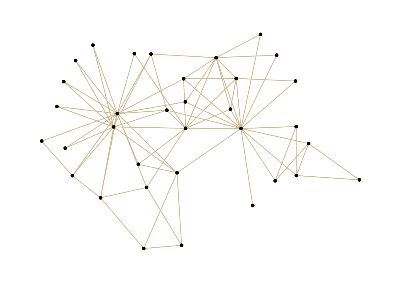
Common parameters:
size: How big the nodes arecolor: The color of the nodesshape: The shape of the nodeswidth: How thick the edges arecolor: The color of the edgesThe layout is where nodes appear on a graph. There are lots of different algorithms that can be used; some of them are very basic—like putting the nodes in a circle or just scattering them randomly. Most of the layouts we will use are based on algorithms that try to keep nodes which are connected to each other close together and unconnected nodes far apart from each other.
You can let ggraph choose a layout for you or you can look through some here and here.
We actually don’t add a new layer for the layout: layouts are defined inside the ggraph() function, which has to be called before making any plot. The code below sets 'kk' as the layout, and adds a simple layer for the nodes and a layer for the edges.
G |>
  ggraph(layout = 'kk') +
  geom_node_point() +
  geom_edge_fan()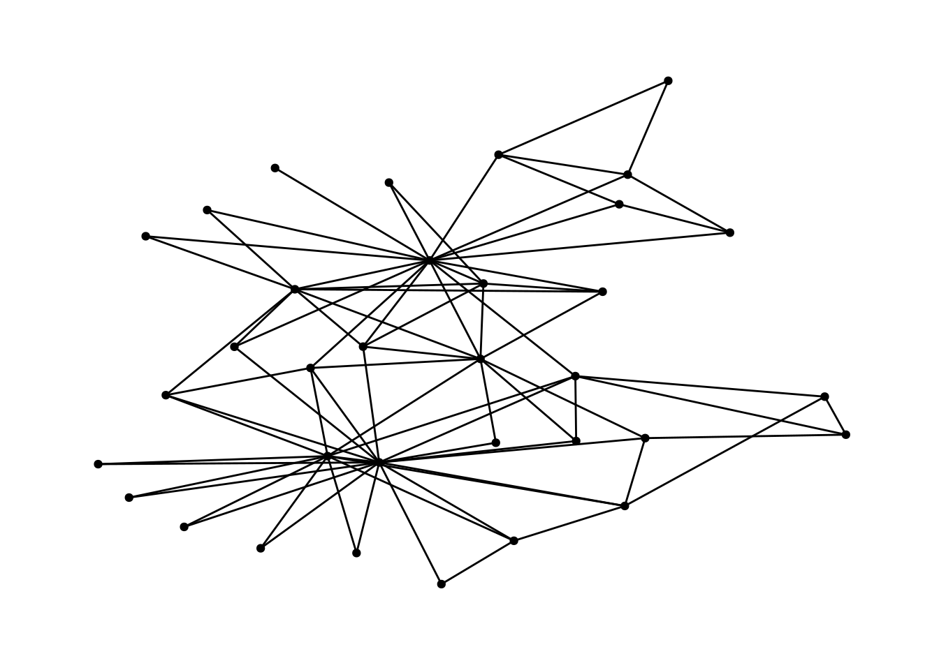
The following plot shows the same network, this time with the nodes in a circle. This shows how changes the layout can really change the look and the interpretation of the plot.
G |>
  ggraph(layout = 'circle') +
  geom_node_point() +
  geom_edge_fan()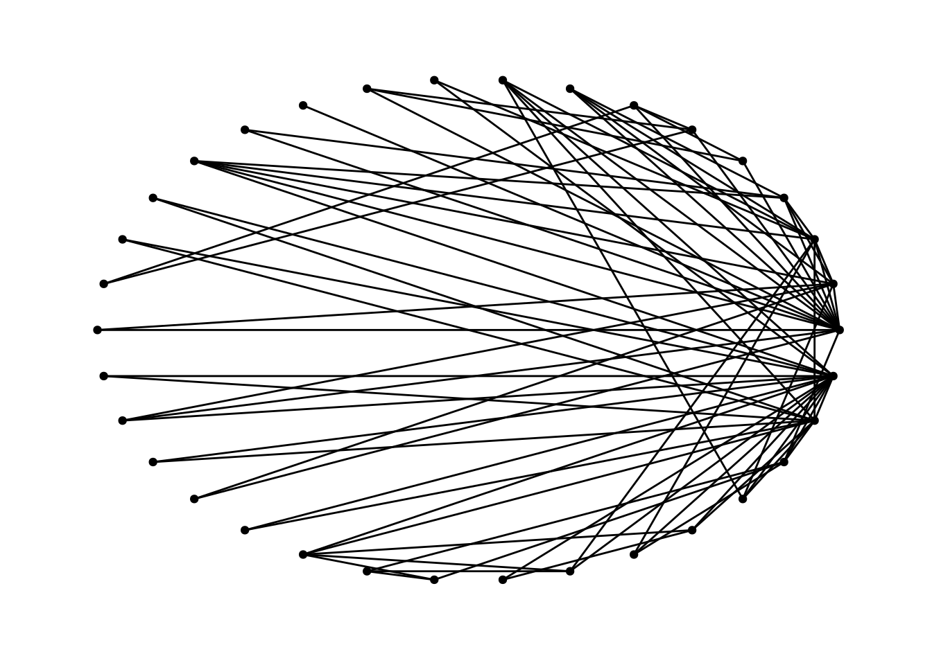
Hopefully this has been a pretty painless introduction to ggraph. Next time we’ll talk about some different options for making your graphs look beautiful and using aesthetics to convey information about the network.
geom_edge_diagonalUsing "stress" as default layout
Using "stress" as default layout
Using "stress" as default layout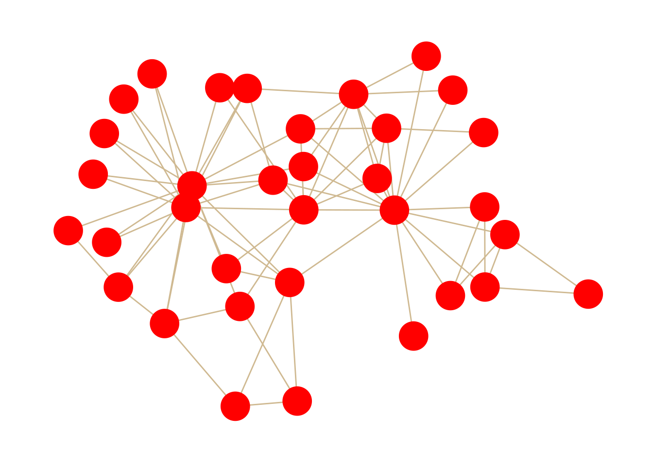
Using "stress" as default layout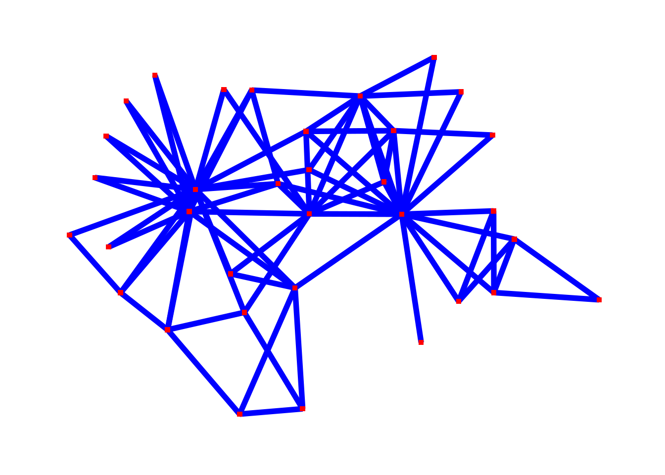
randomly. How does this change what you are able to see in the plot?